

お疲れ様です。
はるさらと申します。
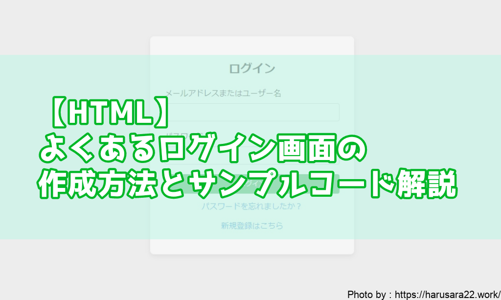
今回は、HTMLでPC向けの
シンプルなログイン画面の作成方法を
記載させていただきます。
HTMLとCSSを使用しており、
PC画面を前提にデザインしますが、
基本的な考え方は他のデバイス用にも応用できます。
コード例とともに必要な要素やポイントを解説しており、
コピペで再現可能ですので
ぜひご自由にご使用いただければと思います。
リンク
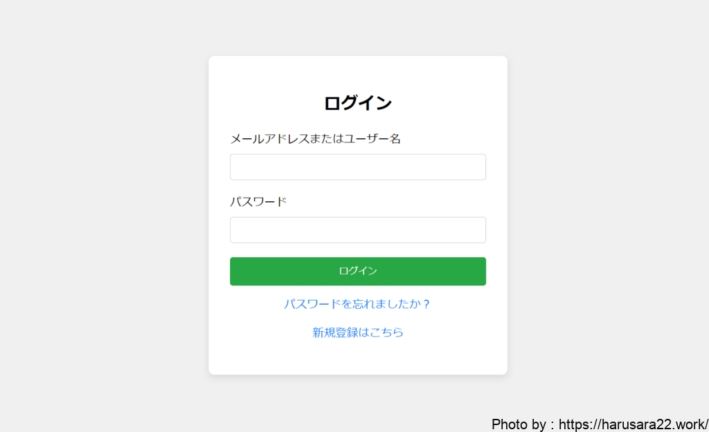
ログイン画面の基本構造
汎用的なログイン画面の部品として、
次の要素で構成されることが一般的です。
- メールアドレスまたはユーザー名の入力欄
- パスワード入力欄
- 「ログイン」ボタン
- オプションとして、「パスワードを忘れましたか?」
のリンクや 「新規登録はこちら」 のリンクなど
これらの基本的な要素を含むフォームを
HTMLで下記のような画面を作成していきます。
HTMLでログインフォームを作成
まず、HTMLでログイン画面の構造を定義します。
<!DOCTYPE html>
<html lang="ja">
<head>
    <meta charset="UTF-8">
    <meta name="viewport" content="width=device-width, initial-scale=1.0">
    <title>ログイン</title>
</head>
<body>
    <div class="login-container">
        <h2>ログイン</h2>
        <form action="/login" method="POST">
            <div class="form-group">
                <label for="email">メールアドレスまたはユーザー名</label>
                <input type="text" id="email" name="email" required>
            </div>
            <div class="form-group">
                <label for="password">パスワード</label>
                <input type="password" id="password" name="password" required>
            </div>
            <button type="submit">ログイン</button>
        </form>
        <p><a href="#">パスワードを忘れましたか?</a></p>
        <p><a href="#">新規登録はこちら</a></p>
    </div>
</body>
</html>
解説:
<form action="/login" method="POST">:
ログインデータをサーバーにPOSTリクエストで送信します。/loginはログイン処理を行うエンドポイントです。<input type="text">:メールアドレスやユーザー名の入力欄を作成しています。<input type="password">:パスワード入力欄は、
入力内容が見えないように●でマスクされます。
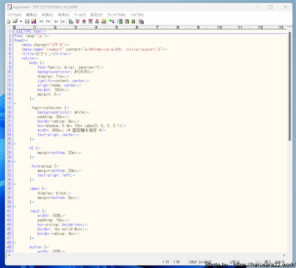
CSSでスタイリング
次に、CSSを使ってログイン画面の
デザインを整えていきます。
今回は幅やレイアウトを固定し、
中央に配置するように設定していきます。
<style>
    body {
        font-family: Arial, sans-serif;
        background-color: #f0f0f0;
        display: flex;
        justify-content: center;
        align-items: center;
        height: 100vh;
        margin: 0;
    }

    .login-container {
        background-color: white;
        padding: 30px;
        border-radius: 8px;
        box-shadow: 0 4px 10px rgba(0, 0, 0, 0.1);
        width: 360px; /* 固定幅を指定 */
        text-align: center;
    }

    h2 {
        margin-bottom: 20px;
    }

    .form-group {
        margin-bottom: 20px;
        text-align: left;
    }

    label {
        display: block;
        margin-bottom: 8px;
    }

    input {
        width: 100%;
        padding: 10px;
        box-sizing: border-box;
        border: 1px solid #ccc;
        border-radius: 4px;
    }

    button {
        width: 100%;
        padding: 10px;
        background-color: #28a745;
        color: white;
        border: none;
        border-radius: 4px;
        cursor: pointer;
    }

    button:hover {
        background-color: #218838;
    }

    a {
        color: #007bff;
        text-decoration: none;
    }

    a:hover {
        text-decoration: underline;
    }

    p {
        margin-top: 15px;
    }
</style>
解説:
.login-container { width: 360px; }:
PC用画面として固定幅を設定しました。
これにより、大きな画面でもフォームが中央に整った形で表示されます。.form-group { text-align: left; }:
ラベルと入力欄を左揃えにしています。button:hover: ボタンにホバー効果を追加し、
上にカーソルが乗ると色が変わるようにしています。
完成形のコード
以下が、CSSとHTMLを1つにまとめた
コードになります。
<!DOCTYPE html>
<html lang="ja">
<head>
    <meta charset="UTF-8">
    <meta name="viewport" content="width=device-width, initial-scale=1.0">
    <title>ログイン</title>
    <style>
        body {
            font-family: Arial, sans-serif;
            background-color: #f0f0f0;
            display: flex;
            justify-content: center;
            align-items: center;
            height: 100vh;
            margin: 0;
        }

        .login-container {
            background-color: white;
            padding: 30px;
            border-radius: 8px;
            box-shadow: 0 4px 10px rgba(0, 0, 0, 0.1);
            width: 360px; /* 固定幅を指定 */
            text-align: center;
        }

        h2 {
            margin-bottom: 20px;
        }

        .form-group {
            margin-bottom: 20px;
            text-align: left;
        }

        label {
            display: block;
            margin-bottom: 8px;
        }

        input {
            width: 100%;
            padding: 10px;
            box-sizing: border-box;
            border: 1px solid #ccc;
            border-radius: 4px;
        }

        button {
            width: 100%;
            padding: 10px;
            background-color: #28a745;
            color: white;
            border: none;
            border-radius: 4px;
            cursor: pointer;
        }

        button:hover {
            background-color: #218838;
        }

        a {
            color: #007bff;
            text-decoration: none;
        }

        a:hover {
            text-decoration: underline;
        }

        p {
            margin-top: 15px;
        }
    </style>
</head>
<body>
    <div class="login-container">
        <h2>ログイン</h2>
        <form action="/login" method="POST">
            <div class="form-group">
                <label for="email">メールアドレスまたはユーザー名</label>
                <input type="text" id="email" name="email" required>
            </div>
            <div class="form-group">
                <label for="password">パスワード</label>
                <input type="password" id="password" name="password" required>
            </div>
            <button type="submit">ログイン</button>
        </form>
        <p><a href="#">パスワードを忘れましたか?</a></p>
        <p><a href="#">新規登録はこちら</a></p>
    </div>
</body>
</html>
上記のコードをlogin.html等の
テキストファイルに貼り付けて
実行してあげれば初めに貼ったような
ログイン画面を開くことができます。
まとめ
今回紹介したログイン画面は、
固定幅を持つデザインでシンプルに作成されています。
デザインをさらに改良したり、
JavaScriptでフォームのバリデーションを追加することで、
機能を強化することも可能ですので
ご自由にご使用いただければと思います。
どなたかのお役に立てれば幸いです。
それではまたー!!
リンク


